Why you should think mobile-first for your business' website

Why you should think mobile-first for your business' website
04 September 2023 | Published by Bryony Pearce
Creating a top-notch website is one of the most important elements to running a business - it’s the first impression a consumer on the hunt for a new product or service will get of you, and if it’s not up to scratch it could put them off from the get-go and ultimately lose you sales.
From load speed and page design to branding and URL, there’s plenty to think about when it comes to creating a great website, but one of the major developments of recent years and a crucial thing to get right is ensuring your website is mobile-first.
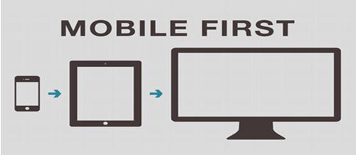
What is mobile-first?
A mobile-first approach to designing (or redesigning) your website involves designing it from a mobile perspective first, rather than a desktop view, and then expanding the design to suit larger screens like desktop and tablets afterwards.
Essentially, mobile-first design flips the traditional design method on its head.
Websites loaded on a mobile device are much more compact, with more restrictions on space as well as capacity, meaning the traditional desktop design oftentimes leaves users presented with a scramble of text overlapping images, making readability poor, and ultimately offering a poor user experience.
By designing mobile-first, the website is built in a more restricted way to avoid this problem and is then expanded to create a desktop or tablet version.
Why is mobile-first important?
The rise of mobile
As of December 2019 over half of consumer-based web traffic was done using mobile devices, compared to just 31% five years earlier.
The stats show that this trend towards mobile browsing is true of all consumer demographics (i.e. it’s not just youngsters) and the experts believe the numbers will rise by a further 25% in the next five years.
So, a mobile-first design is important to engage your audience, and at least half of your target market will find your website on mobile.
Mobile-first indexing
Google ranking is a mega important element to success on the web - the higher your website ranks in a Google search (and there are 70,000 of these per second!), the higher the likelihood a consumer will click-through to your site.
- The top-ranked website in a Google results page receives 10X more click-throughs than the website in position 10.
- Moving up one position in Google rankings increases click-through rate by over 30%.
- The top result gets nearly a third of all clicks.
Where your website ends up in results depends on a number of ranking factors - when a query is entered Google crawls your site and indexes its content for these factors, and the more boxes ticked, the higher the ranking.
As of July 2019, Google announced a new ranking factor for all new websites called mobile-first indexing.
To put it simply, Google now crawls and indexes websites based on how they display on mobile, so if your site isn’t mobile-first it’ll impact how you rank in search results, and as we’ve seen this could have a major impact on your website traffic.
What if I have an established website?
Google originally stated existing websites would continue to be monitored and evaluated based on their mobile-first best practices, and website owners would be informed within Google Console on which date their site was moved over to the new mobile-first indexing.
In March, Google announced that mobile-first indexing would be enabled an all websites from September 2020.
It might sound a bit confusing, but in essence, what it means is old and new websites alike will now be indexed and ranked based on their mobile-first practices, so it’s important you apply mobile-first design thinking to your existing website so you don’t miss out.
Google best practices
It’s a good idea to scrub up on the ins and outs of Google’s best practices for mobile-first, and you can read their detailed breakdown here, but to give you an overview you’re expected to:
- Ensure Googlebot can access and render your website’s content
- Make sure the same content is on your mobile and desktop sites
- Check your structured data is present on both versions
- Have the same metadata on mobile and desktop
- Check ad placement and follow the Better Ads Standard
- Check your videos and images, following best practices for each
Top tip: At the bottom of the best practices webpage (link above) you’ll find a log of recent updates, so you can always check there’s nothing new you’re missing that could hinder your success.
The benefits of mobile-first
Besides the obvious ranking benefit, there are other perks to be had by applying mobile-first design:
- More sales - and who doesn’t want that? Conversion rates on mobile are up a whopping 64% compared to desktop.
- Customer satisfaction - designing mobile-first inevitably means cutting out unnecessary clutter from your website and this means it loads faster and offers quicker downloads - both big ticks for consumers.
- Less cart abandonment - fast load times mean fewer consumers will give up and walk away from a purchase - a tiny one-second delay has been shown to cause a 7% drop in conversions, and 40% of consumers abandon a site that takes more than three seconds to load.
How do I achieve mobile-first?
The key to achieving mobile-first design is to approach it from a content mindset - mobile screens can fit fewer elements on a page, so essentially you need to cut the wheat from the chaff on your website.
A mobile-first website will:
- Be responsive and automatically resize to fit the device being used
- Use fonts large enough that they’re easy to read on a smaller screen
- Be easy to navigate via accessible menus
- Ensure crucial content isn’t blocked by ads
- Load quickly
Remember, if you don’t count yourself a tech boffin and this seems out of your comfort zone, you can always reach out to a web developer for help and support achieving a mobile-first design.
How to test your website
A super quick and easy way to check your site’s up to scratch is to use Google’s own Mobile-Friendly Test - all you need to do is copy and paste your website’s URL into the box, hit ‘test’, and you’ll be shown any issues detected or pages that need attention.
It’s a good idea to check each page on your website as you build or modify it to be mobile-first. Testing as you go like this will allow you to fix and iterate as you build, saving you a lot of legwork and back and forth down the line.
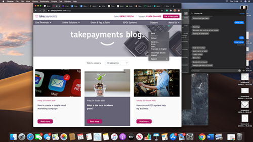
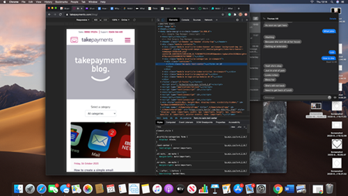
A little known trick for testing your site is to open it within Google Chrome and right-click anywhere on the page and select ‘inspect’.
Next up click on the ‘toggle device toolbar’ pictured below.
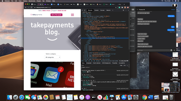

Voila, you’ll now see your website in mobile view and be able to quickly spot any issues and rectify them pronto.
Did you know that you can take payments online through your website with takepayments? We have a few different online products available. From letting people buy through your website, sending them an email with a payment link in it, or taking payments over the phone with our online virtual terminal, we've got one for you.
Like what you’ve been reading? You’ll find tonnes more resources to help with designing and maintaining a top-class website for your small business over on our dedicated blog!


